What kind of mobile website is right for you?
 By Katie Te Nahu Owen
Demand for mobile websites is rapidly rising, and when we look at the smartphone usage statistics in New Zealand, it's no wonder why:
- There are over 800,000 smartphones in New Zealand
- More than a quarter (27%) of Internet users access the Internet from a hand-held mobile device such as a smartphone or an iPad
- 12% of Internet users, over 10% of the NZ population as a whole, spend 5 hours or more a week online from a wireless hand-held device
When clients come to us looking for a mobile website solution, we talk them through the three options they have.
Option one - Responsive
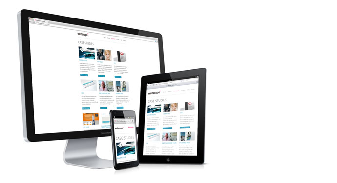
The first option is using a responsive website design, also known as an adaptive or mobile first design. Responsive web design is fast becoming the standard approach for designing and building websites.
The great thing about responsive themes are that they are pretty much future proofed, no matter what screen size you're viewing on, whether viewing on mobile, tablet or even a Cinema Display TV for that matter, the site, both copy and images, adjusts to your screen (or in developer speak it refers to a website that is designed and built with fluid proportion-based grids, to adapt the layout to the viewing environment, and also flexible images).
It also means it will continue to work on devices that aren't available yet as the code behind the website isn't specific to any set of smartphones or devices. As a result, users across a broad range of devices and browsers will have access to a single source of content, laid out so as to be easy to read and navigate with a minimum of resizing, panning and scrolling.

Our own website is built on these principles - go ahead and play with the responsive goodness by resizing your browser now, or visiting the website using your smartphone, tablet or Internet enabled television - regardless of the device used to visit the website, it looks beautiful at any size.
Option two - Mobile specific
The second option is a version of the website that's built specifically for mobile devices which is perfect for businesses that have customers who want to get things done while away from their computer. This option is great for those who take bookings online, such as restaurants or hairdressers; quick online purchases, such as domain names or sales sites; or for companies that need to display important information or status updates, such as power companies or web hosting providers. There are many more use cases for a mobile specific website though, so please contact us if you want to find out if this is the right option for you - we've had some clients, such as Telecom, that have simply implemented a different version of the homepage for visitors using smartphones.
As we build the websites we develop using Drupal, it's easy to administer both the standard version of the website and the mobile version of the website from one place - we build the website in a way that different content is displayed with a different look & feel depending on the context. We can implement device redirection so that smartphone visitors are automatically redirected to the mobile version of your website. It's also recommended to use a responsive web design for the standard version of the website so that it's bulletproof across all other devices, and works well if you offer mobile users the option to visit the full website.
One of my favourite examples of a mobile specific website is ASB Bank's mobile website, which can be viewed at http://m.asb.co.nz
They have the information that you'd be after when out and about, such as finding the nearest branch or ATM, their phone number, and Internet Banking login. They also have a couple of other minor links, and the ability to go to the full ASB website, all beautifully presented in a style that works well with the context and is familiar to iPhone owners.
Option three - Tweaking
The last option is testing the website on devices such as iPhone, iPad and Android phones and implementing any changes required so that the standard website displays appropriately and is usable on mobile devices. We generally recommend one of the previous two options rather than this approach for new website builds, but this option is suitable for designs that don't fit a responsive design and is a great cost effective approach for websites built prior to the proliferation of mobile devices.
Get in touch with us if you'd like to have a chat about the type of mobile website that will work for you.
* Statistics from http://blog.jericho.co.nz/new-zealand-smartphone-penetration/